Staying Within Proper Theological Boundaries: A Fascinating Icon
May 21, 2023 12 Comments
![]() On a number of levels, I find this icon fascinating![1]
On a number of levels, I find this icon fascinating![1]
It takes the phrase homoousion tō Patri (“co-essential/consubstantial with the Father”) from the Greek of the Nicene Creed and adapts it in rather curious ways. Simultaneously, it appears to extract at least one other aspect of the message of the Creed into it.
First of all, the text/icon appears to be an unusual combination of mostly majuscule (akin to UPPER CASE letters) and one or a few minuscule letters (akin to lower case letters).[2] Secondly, and more obviously, the icon has placed one character over another multiple times.[3] Thirdly, it features an unusually depicted staurogram—the superimposition of a rho (P) over a tau (T), designed to visually represent Christ hanging on the Cross.[4] The latter may be a way of incorporating “crucified for us” from the Creed into the word for “Father” (here in its dative form ΠАΤΡΙ), by fashioning the alpha (A), tau (T), and rho (P) into one composite character in which each share one vertical stroke. Perhaps this is the icon-maker’s way of expressing that, in order to maintain the ‘co-essence’ of the Trinitarian ‘Persons’, in a sense, God the Father ‘died’ on the Cross?[5]
Fascinating!
To better explain the particulars, allow me to provide my (non-artist’s) rendering of what this icon would look like if the phrase were in all majuscule without any letters placed atop or superimposed upon any others. In keeping with the usual practice, no spaces are placed between the words (diacritics, aka accents, are included).
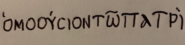 The accent over the first omicron (O) is what is known as the rough breathing mark, indicating to sound the vowel with a prepended English “H” (“ha”). This is the reason for its transliterated spelling homoousion.
For comparison, below is the majuscule in modern keyboard text (sans diacritics) and below that is the minuscule (with diacritics, including the iota subscript under the omega):
![]() ΟΜΟΟΥCΙΟΝΤШΠАΤΡΙ
ΟΜΟΟΥCΙΟΝΤШΠАΤΡΙ
ὁμοούσιον τῷ Πατρὶ
The 3rd ‘character’ from the left in the icon, which resembles a ‘snowman’, is actually three letters stacked one atop another. But they are not even in the correct order! They should be omicron (O), omicron (O), upsilon (Y). However, assuming the ‘hands’ of the ‘snowman’ indicate the upper portion of the upsilon (Y), then the icon shows an omicron at top, the chopped upsilon below that, and the second omicron on the bottom. I can only speculate as to why the icon was written this way.
Note that the way the acute accent (΄) is placed in the icon it appears to be intended to go over the truncated upsilon (Y), as opposed to the upper omicron. This would be consistent with where it should be placed had it been written out normally (see my rendering above). I might speculate that the second omicron (O) is at the bottom because of what might be considered an alternate spelling, in which this second omicron is dropped completely.[6]
In order, the next oddity in the icon is the omega (ω) under the tau (T), and the circumflex (˜) over the tau instead of the omega (see my rendering above for correct placement of circumflex). Given the stacking of omega under tau, the positioning of the circumflex makes sense. In other words, the circumflex would normally go over the omega, and since the tau is stacked over the omega, it follows that the circumflex would go over the tau/omega.
This tau/omega constitutes the Greek article (in its dative form), which is translated here as “with-the”. With that in mind, this looks to be simply an artist’s rendition of the article in this important phrase from the Creed. I like the idea!
The final curiosity in the icon is by far the most intriguing. Within the word ΠАΤΡΙ, the artist here has stacked the alpha (A—but see my rendering above for the usual depiction of this letter) atop the tau (T), and the rho (P) just under the tau, in such a way as to approximate the stylized staurogram. Essentially, the artist ‘bent’ the alpha such that the long, angled line of it is verticalized in order to conjoin it with the vertical axis of the tau, while also placing the curved portion of the alpha atop the horizontal bar of the tau. Comparatively, in the usual staurogram it is the curved portion of the rho (P) which sits atop the horizontal bar of the tau (T), in order to resemble a drooping head on a cross. Here it looks as though the artist purposefully drew one head over the horizontal bar of the tau (the curved portion of the alpha) and another head just below the horizontal bar (the curved portion of the rho) in order to depict not one, but two heads on the Cross. Is this to indicate Father and Son (cf. Acts 20:28: “…Ekklēsia of God, which [God] purchased with His own blood”)? Restating from above: Is this the artist’s way of expressing that, in order to maintain the ‘co-essence’ of the Trinitarian ‘Persons’, in a sense, God the Father also ‘died’ on the Cross?
Once again, fascinating!
![]()
______________________
[1] This icon is sourced from the Wikipedia page of Nicene Creed, under the History section. I have not yet determined its provenance.
[2] Assuming this icon was intended to appear contemporaneous with the establishment of the 381 (or 325) Creed, the presence of the iota subscript—the tiny downward mark (͵) centered under the omega (ω)—which was introduced ca. 12th century AD by Byzantine philologists, would render it an anachronism, if the omega is indeed majuscule, which (most of) the rest of the text seems to be. (But see note 3 below.) This is because majuscule (uncial) declined in use ca. 9th-10th century as minuscule had emerged (ca. 8th century) and was favored. But since omega looks the same whether in majuscule or minuscule (besides the smaller size of the latter), it is difficult to determine the intention of the icon maker with respect to this letter. Is the omega here in minuscule instead? If minuscule, why does the rest of the text appear to be in majuscule (but, again, see note 3 below)? If majuscule, why the iota subscript? A curiosity! (Side note: though the majuscule omega is usually depicted as Ω in Greek alphabet listings, Greek NT manuscripts use Ш instead, as far as I am aware.)
[3] Since the omicron looks the same whether in majuscule (O) or minuscule (o), besides the size, one cannot determine which is in mind in the ‘snowman’ character—the third from the left—which is actually three letters (omicron, omicron, upsilon) in one space! It is also possible the upsilon—the ‘hands’ of the ‘snowman’—is in minuscule (υ), as opposed to majuscule (Y). More on this further below.
[4] Staurograms are found in a number of Greek NT manuscripts from Alexandria, Egypt. In these, the Greek word for “cross” (stauros, CTAYPOC) is abbreviated and styled to resemble Christ hanging on the Cross. See hyperlink in main text above. Cf. the following papyrus at The Center for the Study of New Testament Manuscripts, specifically the end of the fourth line of manuscript P75 @ Luke 14:27. Click on manuscript to enlarge. Note that the word here (in the accusative) is CTAYPON, yet the staurogram eliminates both the alpha (A) and the upsilon (Y) as it depicts one hanging on a cross. Also note the overline atop the entire word, which was standard practice for what are known as Nomina Sacra.
[5] This is not necessarily heretical; it depends on how it is construed. See Forsaken For Our Sake, taking special note of footnote 1 there.
[6] See Schaff/Wace, EXCURSUS ON THE WORD HOMOUSIOS, as found on pp 3–4 here.

Recent Comments